
DATA ANALYTICS · MACHINE LEARNING · DEEP LEARNING

Yi Pan

I earned my master's in data science at Rice University. I've worked with engineering teams in the US and on projects that use data and machine learning to solve practical problems.

Explore my projects

Education Background

  • Rice UniversityMaster of Data Science
  • Drexel UniversityBachelor of Science · Data Science
  • Lanzhou UniversityBachelor of Engineering · Computer Science & Technology
Open to Data Science, Data Analytics & Machine Learning roles

Technical Depth+Business Context

I enjoy both the technical and business sides of a problem. I start by understanding what a team needs, then use data and models to explain what is happening and suggest practical next steps.

My experience includes engineering internships in the United States and technical coordination for North American business. I bring experience working in English across technical and business teams.

Analyze

Python · pandas · SQL

Data preparation, exploratory analysis, customer understanding, and interpretation.

Model and Architecture

PyTorch · TensorFlow · Scikit-learn · OpenCV

Machine learning, Transformers, graph theory, and computer vision.

Integrate

Flask · Git · Docker · AWS

Connecting models to applications and collaborating across engineering disciplines.

01

University–industry collaboration

Houston Grand Opera

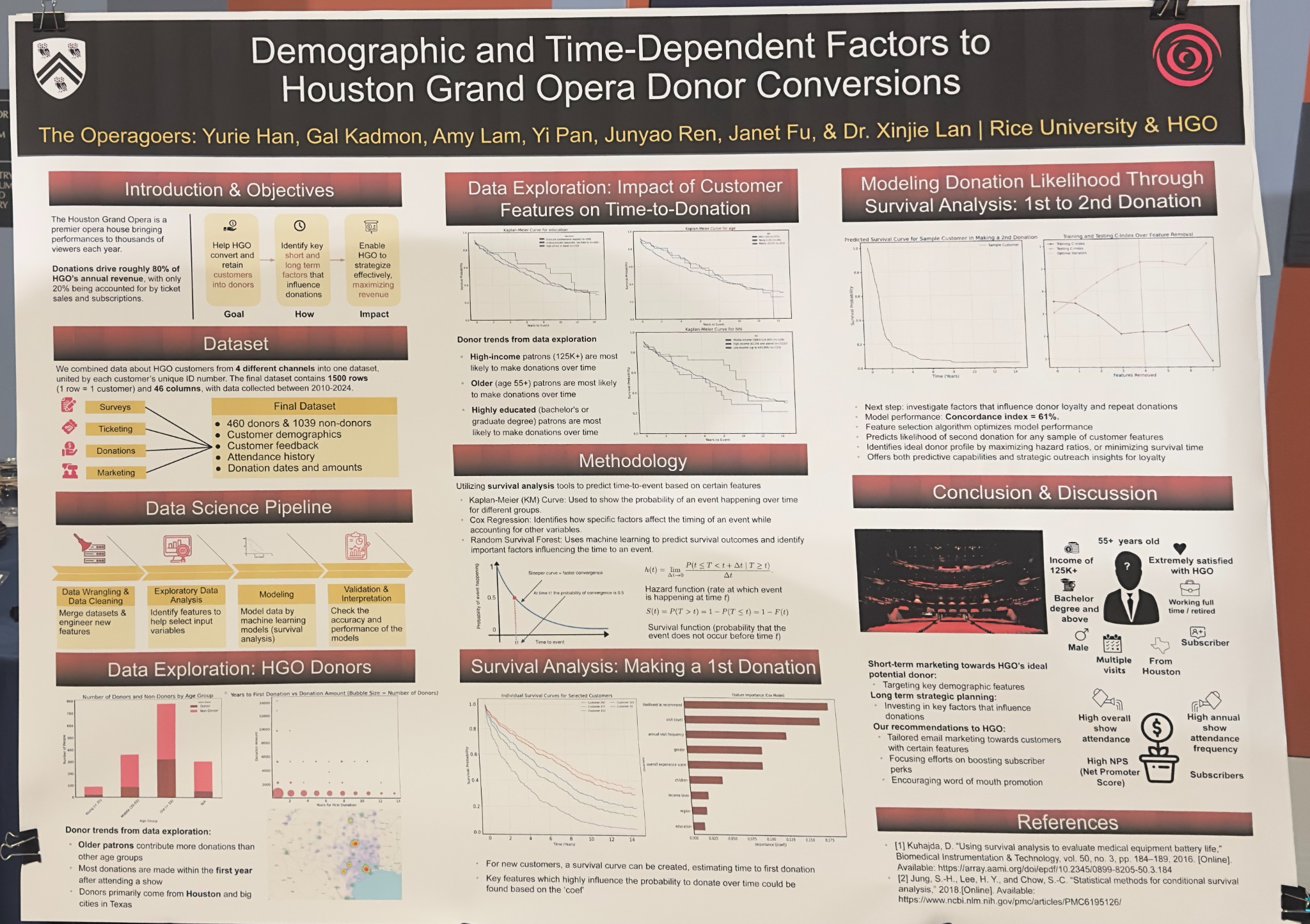
Houston Grand Opera donor conversion project poster presented by the Rice teamView presentation poster
HOUSTON GRAND OPERA × RICE D2K

Understanding when opera audiences become donors.

A Rice D2K collaboration with Houston Grand Opera: connecting audience profiles, donation timing, and fundraising decisions through survival analysis.

Donor conversionSurvival analysisCustomer analytics
Project overview & contribution

Project Scale and Results

Customer records · 2010–2024
~1,500
Fields across 4 sources
46
First-donation RSF · Evaluation C-index
0.733

Combined customer data from surveys, ticketing, donations, and marketing. Saved notebook experiments compare models for first and repeat donation timing; the results below distinguish training scores from evaluation scores.

The question

Which demographic and time-dependent factors are associated with a first donation—and a return donation?

My contribution

I worked across the full project with the team: merging and cleaning customer data, exploratory analysis, survival modeling, evaluation, and business recommendations. I also presented our work and answered questions at the poster session.

Approach & deliverables

  1. Integrate Customer Data

    Combined survey, ticketing, donation, and marketing data using customer IDs to connect audience characteristics with attendance and donation history.

  2. Analyze Time to Donation

    The team used Kaplan–Meier curves, Cox proportional hazards modeling, and random survival forests to study time-to-event outcomes, including first and repeat donations.

  3. Translate Findings for Stakeholders

    Explored how characteristics such as age, income, and education were associated with donation timing, and discussed targeted outreach and audience development recommendations.

Where Are the Customers?

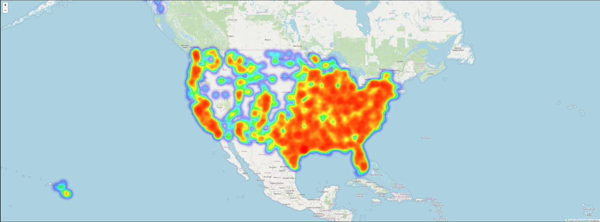
Mapped customer ZIP codes to explore their geographic distribution across the United States. The heatmap helps describe audience reach; warmer areas indicate stronger concentrations in the displayed data, not higher donation rates.

Customer distribution by ZIP code · EDA output · Basemap © OpenStreetMap contributors

When Might a Customer Donate?

Survival analysis studies how long it takes for an event to happen. Here, the event is a first or second donation. Cox regression gives an interpretable statistical model; Random Survival Forest (RSF) combines decision trees to capture more complex patterns.

Task and ModelTraining C-indexEvaluation C-index
First donation · Cox, full feature set0.7310.717
First donation · Random Survival Forest0.8000.733
Second donation · Cox, before feature selection0.6030.581

Saved notebook outputs, rounded to three decimals, from 80/20 splits. These are exploratory results: evaluation data were also consulted during feature and parameter selection. They are not a fresh, untouched final test. The poster’s second-donation score of 0.61 is from a full-data fit; feature-removal experiments reached about 0.625 on the reused evaluation split.

Reading the Results

C-index · Which Customer Donates Earlier?

Measures how well the model orders donation times among customer pairs that can be compared. 0.5 is chance-level ordering; 1.0 is perfect ordering. A score of 0.733 is roughly 73 out of 100 comparable pairs ordered correctly, with ties receiving partial credit. It does not mean 73.3% of customers will donate.

Survival Probability · Not Yet Donated

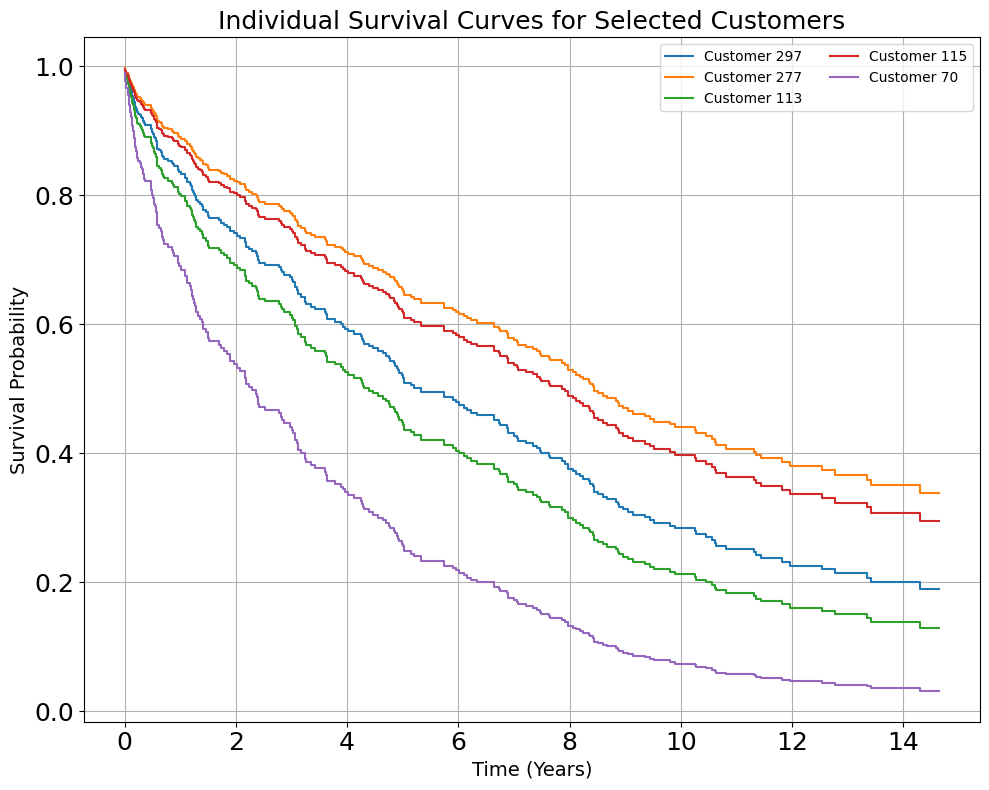
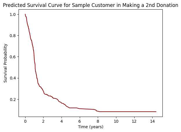
In these plots, “survival” means the donation has not happened yet. A value of 0.7 at year 2 means an estimated 70% chance of no donation by then; 1 − 0.7 = 30% is the estimated chance of a donation by that time. A faster fall indicates earlier predicted giving.

About C-index and survival curves
First donation · Predicted curves for five selected customers from the reduced-feature Cox model.
Second donation · Model prediction for an example customer profile.

These curves illustrate model predictions, rather than observed conversion rates.

From Customer Profile to Outreach Plan

A Profile to Explore

The team’s analysis highlighted Houston-based subscribers aged 55+, with a bachelor’s degree or higher, annual household income of $125,000+, and strong satisfaction and willingness to recommend HGO. This describes a candidate outreach segment, not a rule that every donor must match.

Recommended Actions
  • Frequent Attendance

    Give repeat visitors relevant follow-up and consider annual visit frequency when planning outreach.

  • Subscription Relationships

    Build on existing subscriber relationships and strengthen subscriber benefits.

  • Strong Recommendation Intent

    Support engaged customers with a good experience and opportunities to recommend HGO to others.

NPS (Net Promoter Score) summarizes how willing customers are to recommend an organization. Here, recommendation responses help describe engagement; they are distinct from overall satisfaction.

These are proposed actions informed by the analysis; resulting fundraising gains were not measured in this project.

Private university–industry collaboration repository. Access requires authorization.
02

Software Engineering Internship · Sep 2022–Mar 2023

Crane Payment Innovations

Device demonstration · 12 sec · silent
CRANE PAYMENT INNOVATIONS

Bringing computer vision into a physical machine.

Product recognition and counting for a vending-machine prototype, bringing together image capture, cloud model training, and local deployment.

Computer visionOpenCVAWSHardware integration
Project overview & contribution

The question

How can a vending machine use a camera and a positioning mechanism to recognize and count products?

My contribution

I collaborated with a mechanical engineer and worked across motion-control logic, image collection, data preparation, model experiments, and local integration.

Approach & deliverables

  1. Control and Capture

    Refactored C-based positioning logic using a state machine for the XY mechanism. Developed Python/OpenCV scripts for camera control, image acquisition, and preprocessing.

  2. Train and Compare

    Used S3 and SageMaker labeling workflows, then trained and evaluated object-detection models on GPU-enabled EC2 instances using PyTorch and TensorFlow.

  3. Deploy and Integrate

    Moved the selected model from Ubuntu to a Windows environment and connected inference with the camera and positioning system for recognition and counting.

Extended demonstration · 38 sec · silent. Bounding boxes show detected products in the prototype camera feed.

Company-owned work. Demonstration videos show the prototype output; source code, internal datasets, and non-public implementation details are not shared.

03

Team course project · 2022

NYC Traffic Prediction

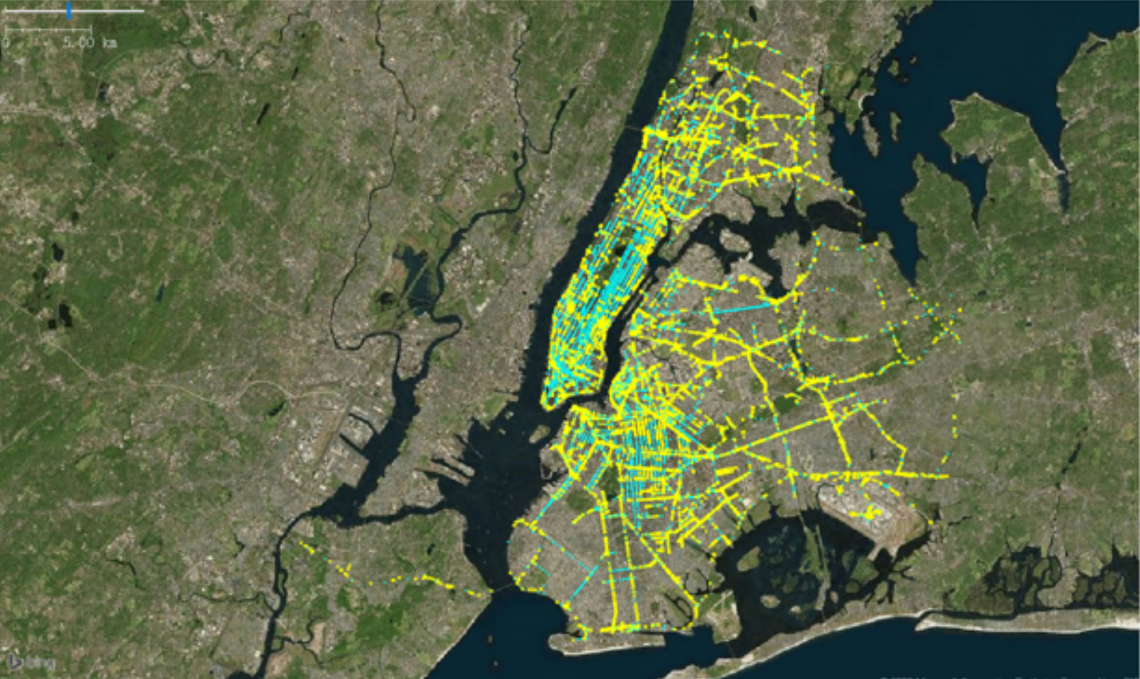
New York City road network used in the traffic projectNew York City road network · Project visualization
DREXEL UNIVERSITY

Learning how connected roads influence traffic speed.

New York City traffic-speed prediction using Uber Movement data, OpenStreetMap road structure, and a multi-head graph attention model.

Graph attentionPyTorchTime seriesExploratory analysis
Project overview & contribution

Project Scale and Results

Graph nodes
21,947
Graph edges
74,783
Hourly time steps per node
744

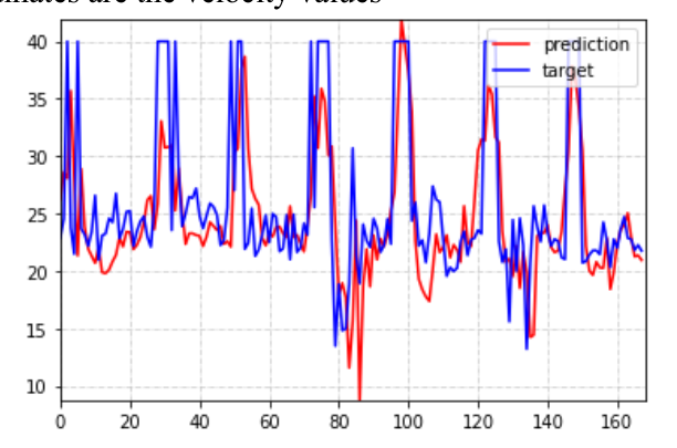
The report records a GAT MAE of 7.1 and RMSE of 9.55 (Table II), alongside a prediction-versus-observation plot for the final seven days. Values are quoted as reported; the table does not specify their units or scaling. The 744 time steps include filled gaps, rather than 744 measured observations for every node.

MAE is the average size of prediction errors. RMSE gives larger errors more weight. For the same target and scale, lower values are better; neither is an accuracy percentage.

The question

How can the structure of a road network and historical speeds help predict the speed of a road segment?

My contribution

I worked across the full pipeline in a three-person team: data preprocessing, exploratory analysis, graph construction, GAT development, evaluation, and the final report.

Approach & deliverables

  1. Build the Graph and Inspect the Data

    Combined road-network structure with speed observations. Explored temporal patterns, autocorrelation, and relationships between centrality measures and speed.

  2. Apply Graph Attention

    Used the adjacency structure to restrict attention to connected nodes, normalized attention weights, and combined multiple attention heads in a PyTorch model.

  3. Evaluate and Interpret

    Compared the model with Prophet and random forest baselines using MAE, MAPE, and RMSE. Inspected predicted versus observed speeds and discussed computational and neighborhood limitations.

From Raw Records to a Road Graph

Mapped road-segment identifiers to graph nodes, checked hourly coverage, selected a more complete subgraph, and aligned speed observations for model input. The original project used a fixed speed assumption to fill remaining gaps; those filled values are not observations.

Preprocessing workflow · Report Figure 3

Exploring Network Structure

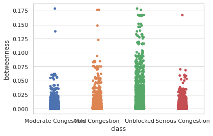
Compared degree and betweenness centrality across congestion groups to explore how a road’s position in the network relates to traffic conditions. These plots describe associations and helped motivate a graph-based model.

Degree centrality by congestion group · Figure 22
Betweenness centrality by congestion group · Figure 24

Prediction & Model Architecture

Predicted and observed speed for one node in the report's test period.
The team's model architecture, as documented in the original report.

Team: Harry Zhao, Yi Pan, Yantian Ding. Figures from the team report, including preprocessing, centrality analysis, and model results.

04

Software Engineering Internship · May–Aug 2024

StarTree

Application, backend, prediction service and data integration at StarTreeView system architecture
STARTREE

From operational data to configuration recommendations.

A machine learning service for infrastructure capacity planning, connecting Python model inference with a Java application backend.

Scikit-learnFlask & Spring BootPinot SQLDockerPrompt Engineering
Project overview & contribution

The question

How can historical operational data support initial infrastructure configuration recommendations for new users?

My contribution

I worked on data preparation, the prediction microservice, containerization, and integration with the Java backend. I used Pinot SQL queries and Grafana dashboards to inspect historical metrics. In a separate internal AI task, I explored prompt design and reviewed model responses.

Approach & deliverables

  1. Prepare Model Inputs

    Queried historical metrics from Pinot, alongside Kafka-fed data and web-sourced inputs, then integrated and preprocessed the data.

  2. Serve Model Predictions

    Developed a Flask microservice using a Scikit-learn regression model for initial configuration recommendations.

  3. Connect the Application

    Used REST/HTTP integration with Spring Boot, Docker containerization, and GitHub Actions for the deployment workflow.

  4. Prompt Engineering

    Explored prompt design for an internal AI task, including examples, context, and output structure, and reviewed responses to refine the prompts.

Company-owned work. Source code, internal data, and non-public implementation details are not shared. The diagram is a high-level workflow summary.

05

Deep learning course project

Sports Video Retiming

Edited race frame from the sports-video course reportEdited output · course project report
RICE UNIVERSITY

Retiming an athlete inside a sports video.

A video-editing experiment that isolates a target athlete, changes their motion timing, and recombines the scene to explore an alternative race outcome.

Deep learningVideo editingNeural rendering
Project overview & contribution

The question

How can one athlete’s timing be adjusted independently while preserving the surrounding scene and a coherent sequence of frames?

My contribution

Developed and documented a course project spanning frame preparation, athlete-layer separation, tracking, temporal editing, and result analysis.

Approach & deliverables

  1. Separate the Scene

    Prepared 307 frames from a roughly 10-second race video and separated the target athlete from the background for independent editing.

  2. Track and Retime

    Examined layer continuity and occlusion, then adjusted the target sequence through frame selection and temporal editing. The broader workflow also incorporated diffusion-based generation.

  3. Recombine and Evaluate

    Recombined the edited athlete and background. The report demonstrates the retiming effect and identifies remaining tracking and compositing artifacts.

Why Represent the Pose?

Joint positions describe how a person moves from frame to frame. This gives temporal editing a structured way to reason about motion, rather than changing pixels without reference to the athlete’s pose. The illustration below explains that idea; it is not a model-output visualization.

Pose representation · Conceptual illustration from the project report
Source race frame
Source race frame · Course report
Isolated athlete layer
Isolated athlete layer · Course report
Tracking across frames
Tracking across frames · Course report
Edited race frame
Edited race frame · Course report

Contact

Open to Data Scientist, Data Analyst, and Machine Learning Engineer roles. I am also interested in technical roles that connect engineering with business. You can reach me by email or phone.